Using Colour Theory for Evil
One of the basic rules of using colour is that placing opposing colours next to each other makes both colours stronger. For example, orange and blue are opposite each other on the colour wheel, but if you use them next to each other the blue seems bluer and the orange appears, well, orange-ier. This also makes them both a little painful to look it.
Simple, right?
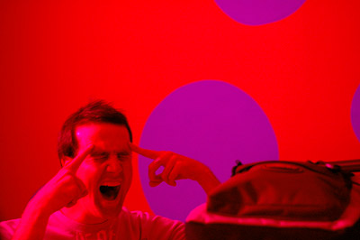
Witness our hostel room in Valencia, Spain:

Red wall + purple dots = hideous painful headache.
There are possibly fewer colour combinations less conducive to relaxing, happy-place sleep than red and purple. Especially when the room is lit with red-tinted light.
My retinas are still burning.
